CASE STUDY
Magpie: A Responsive App
UX/UI Design
Magpie is a money-saving tool to help users save money quickly in preparation for a big purchase.
With simplicity at its core, the app is user-friendly and accessible to all, removing the stress from finance management.
My Role
As UX/UI Designer working on this project, I was responsible for the creation of the brand guidelines, wireframes, user interface design for both mobile and desktop versions, and mockups.

The 5 W's
Who?
The tool is for anyone who wants to save money quickly for a specific goal over a finite period.
What?
A responsive mobile app allowing all data on income and expenses to be recorded easily, on the go, and from a variety of devices. At a glance, the user is aware of his/her incomings and outgoings, keeping track of his/her saving progress. The tool includes tips and rewards to encourage the user to save wisely.
When?
The user will use the tool in the period before a planned expense or purchase, set with a finite date. By linking the app to a bank account, the user is always up-to-date with his/her income and expenses and has access to expert advice on how to save better and faster.
Where?
As a responsive mobile app, the tool can be used anywhere and on any device.
Why?
Saving money can be a daunting process, especially when a major expense is looming on the horizon. The tool provides a personalised experience tailored to the user’s financial profile. With expert advice, the user is encouraged to find smart ways to save money. Rewards encourage the user to achieve his/her goals faster and wisely.
The Challenge
The challenge for this project was to create an inclusive platform for any user to benefit from the services it offers without alienating the novice customer.
Finance management is an intimidating undertaking so simplicity must remain at the core of the product, with accessible and useful information, encouraging tips and no complicated jargon.
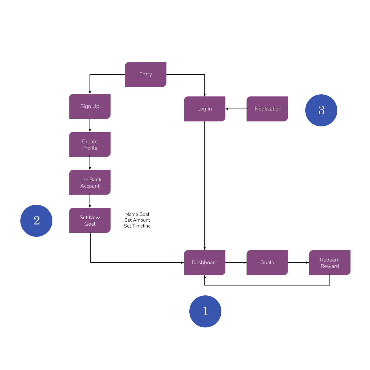
User Stories
I picked three user stories from the brief that I felt provided a solid foundation for a comprehensive user journey whilst using the product.
- “As a user, I want to see a dashboard of my finances clearly and visually, so that I can see how much I am spending on what at a glance.”
- “As a user, I need to be able to tell the tool what my savings goal is and how long I have to reach it, so that I can save accordingly.”
- "As a user, I want to be notified and rewarded when I have reached certain milestones throughout the saving period, so that I know whether I’m on track to reach my goal."
Branding Guidelines
The magpie is often associated with wisdom as it knows how to build a safe, secure and comfortable nest. It’s also known to like collecting shiny objects. These associations fit well with a money-saving tool aimed at users who are keen to prepare for their future and save wisely for a rainy day or a planned purchase.
With this in mind, I built the branding strategy around the three following themes:
- Trust: The user can be confident in the knowledge his/her data is in safe hands
- Accessibility: User-friendly and accessible to all, the tool makes managing finances easy
- Reliability: The expert information provided is accurate and based on the user’s own financial profile and spending habits

Colour
The magpie's tail is tinged with iridescent blues, purples and sometimes greens. I drew from this inspiration to create an uplifting colour palette that evokes wisdom and professionalism.

Typography & Writing Style
Clean and legible, the typography is welcoming: Playfair Display is used to give headings a classical feel with a bold modern twist, evoking trust and professionalism. Yet, a sense of flow gives the product a friendly appeal. Paired with Source Sans Pro, a clean and functional font to maximise legibility, the two come together well with a sense of warmth and harmony.
Concise and straightforward, the writing style moves away from financial jargon and complex instructions to maximise accessibility.

Imagery
Vibrant and playful illustrations are used to add personality to the user experience. They aim to encourage and guide the user in his/her saving plan incorporating the brand’s accent colours.

Ideation & Execution
Drawing from my own situation as a person who’s never used such money-saving apps, I approached the ideation stage with a fresh mindset and a natural tendency for simplification.
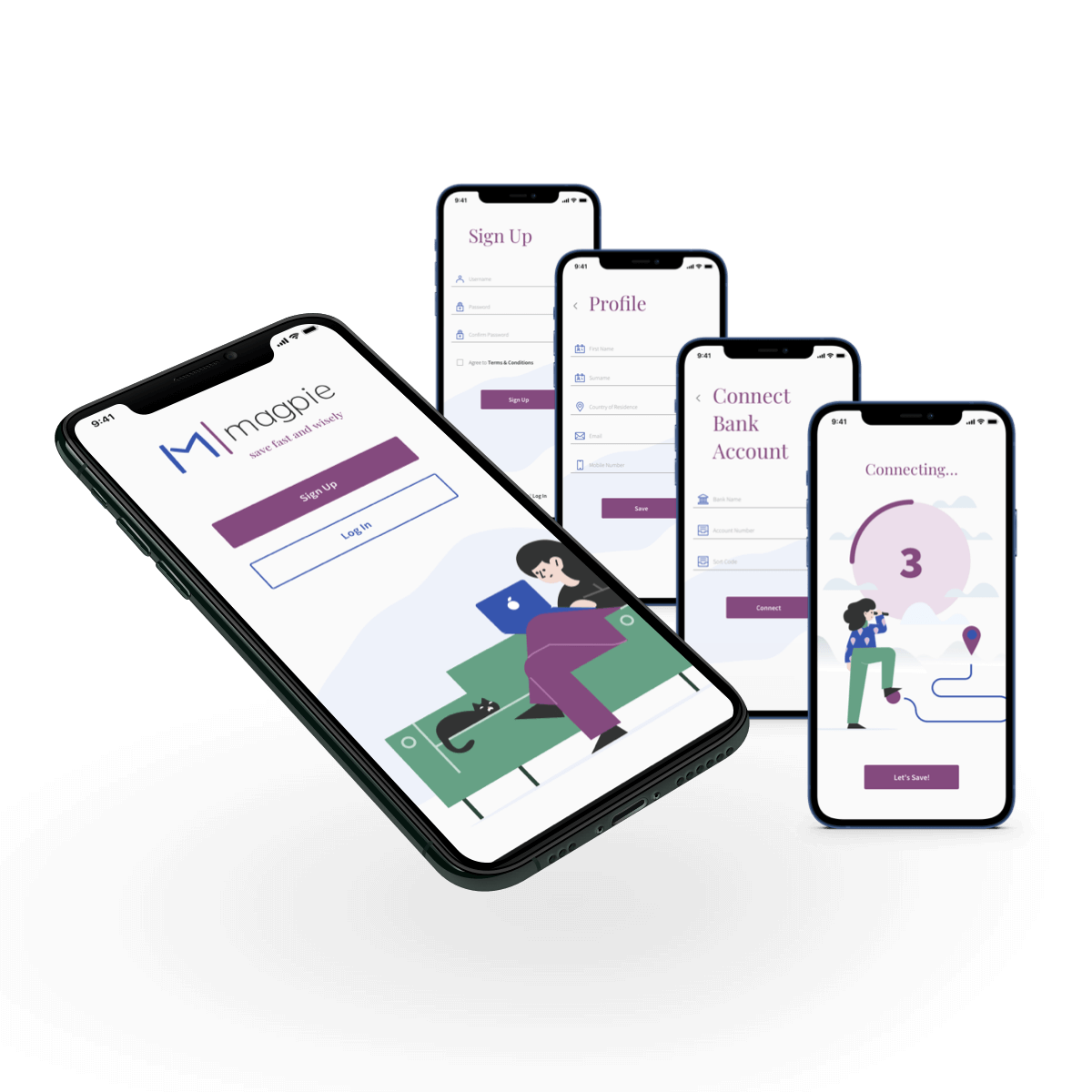
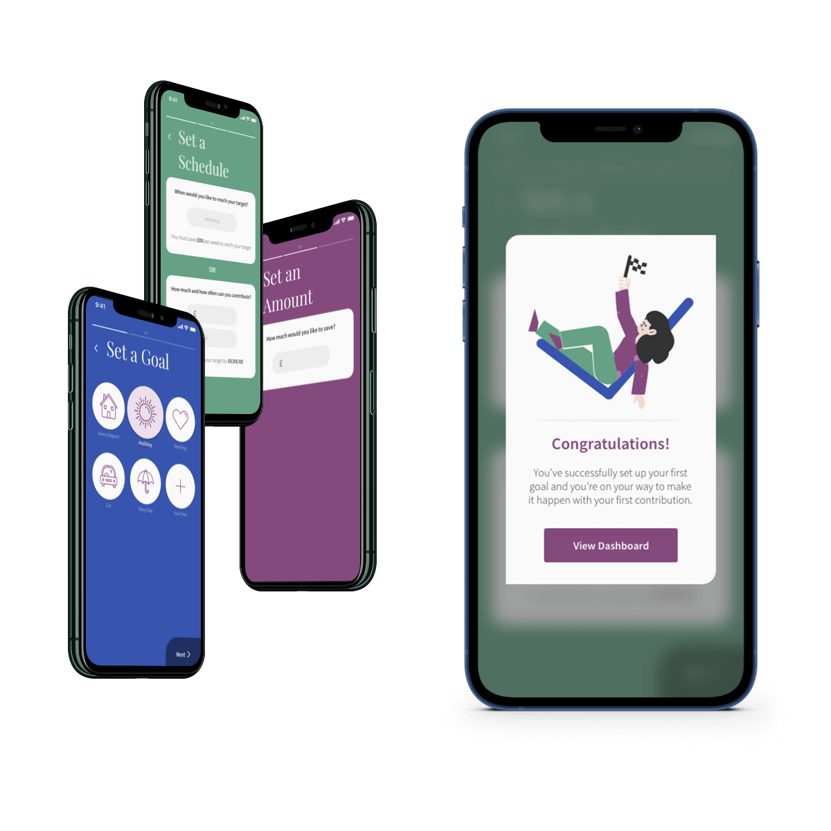
My initial sketches focused on limiting the number of steps for the user to be able to achieve his/her goals. When time is of the essence for someone who wants to save quickly, the last thing they need is a convoluted set-up before they can even get started.
I limited the sign-up process to three steps, and followed this snappy pattern for the goal-setting configuration too. In just a few taps or clicks, the users can make their first saving contribution, already making progress towards achieving their goal.
With this framework set up, I digitised my wireframes and created a simple prototype that I tested on three users.

User Feedback & Iterations
I recruited three participants to test the prototype with the aim to identify any pain points in the flow and overall navigation system. I presented them with a simple task:
“As a new user, you want to create a new goal to save money for a holiday so you can keep track of your progress.”
I received a vast amount of information from this testing session. I synthesised the results and rated each point raised to identify which actions should be taken in priority. I incorporated the most pressing changes, mostly geared towards adjusting some of the wording for clarity and softening some of the designs for a more friendly approach.
With all the elements now in place to guarantee a smooth and intuitive navigation, I proceeded to creating hi-fidelity wireframes by applying the visual components set out in the branding guidelines I created earlier in the process.
A Mobile-First Approach
Working with a mobile-first approach allowed me to achieve a clutter-free layout that would work efficiently on smaller screens with the bare minimum.
Responsive Adaptation
When planning for a responsive layout that would be as effective on larger devices, the biggest challenge was in the adaptation of the Dashboard: incorporating a large amount of data in a comprehensive way without overwhelming the user was key.
To best address this, I expanded the information – not by adding to it, but by applying smart design hierarchy principles, thus enhancing the content’s visual impact.
As a result, the user gets an overview of his/her finances at a glance.
Colour-coded pie charts and progress bars can be read on the spot without any prior knowledge of economics language. The accessibility credentials of the product remain intact.
With the introduction of a playful illustration, the user is encouraged to spread the word about the product in exchange for voucher rewards. An option to access expert advice has been strategically placed under the Add New Goal button. These solutions maximise the user’s active engagement with the product.


Insights
This project was challenging as I was not familiar with such apps myself. I could not draw from my own experience of using them. I had to spend a considerable amount of time researching the market for similar apps, testing them out and trying to identify what the user requirements should be.
On the other hand, this novice vantage point gave me the advantage to be able to relate to the newcomer and therefore create a welcoming experience, accessible to all.
I will look back to this challenge when tackling projects that take me out of my comfort zone in the future. I learnt that being less experienced in a particular field can be used as an advantage.